User-interface styling
This document describes how to customize end-user user-interfaces using CSS stylesheets. Instructions provided apply to version 6 of Trivore ID. Customizing management user-interface (/ui/*) is not supported.
Trivore ID user-interface uses Vaadin library version 25. Vaadin provides styling guide which is available at https://vaadin.com/docs/latest/styling.
Here are some direct links to most common components that Trivore ID uses.
Managing stylesheets
Stylesheets can be managed by navigating to System preferences -> Branding -> Web styling. You can also select default stylesheet which is applied to every end-user user-interface when no other selection is made. OpenID clients may choose to use different stylesheets.
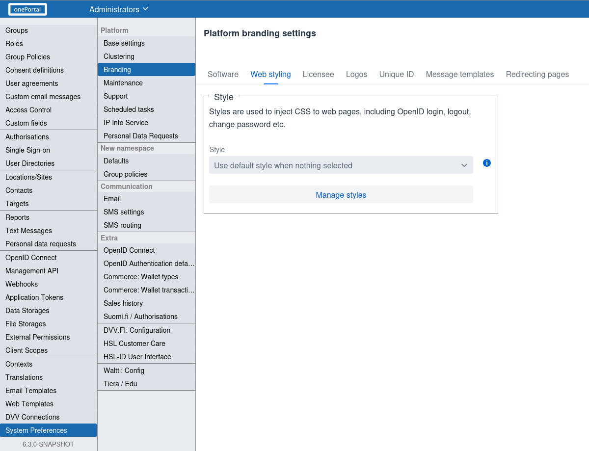
Click "Manage styles" button to open dialog where styles are managed. Click "Add" button to add new stylesheet.
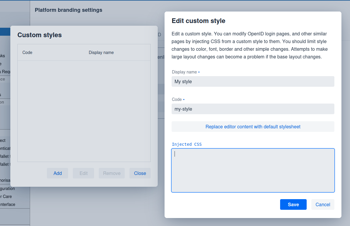
Recommendation is to click "Replace editor content with default stylesheet" button and then customize that default stylesheet.
List of user-interfaces
Default stylesheet is applied to following end-user user-interfaces.
| User-interface | Description |
|---|---|
/accept | Accept user invite view. |
/rp/suomi.fi-valtuudet/authorise | Suomi.fi authorisation to act on behalf of user (henkilön puolesta-asiointi) |
/rp/suomi.fi-valtuudet/authorise/company | Suomi.fi authorisation to act on behalf of company (yrityksen puolesta-asiointi). |
/verifyemail | Verify email address. |
/verifysms | Verify mobile number. |
/bootstrap | Service bootstrap (not relevant here). |
/changePassword | Change password. |
/ldapAuth | LDAP user directory authentication. |
/openid/logout-ui | OpenID sign-out. |
/openid/auth-ui | OpenID sign-in and registration. Different clients may choose to use different stylesheets, not just the default one. |
/personaldata | View personal data requests. |
/resetPassword | Reset password. |
/smartCardAuth | Smartcard authentication. |
List of CSS class names
This section describes CSS class names that can be used to customize parts of the user-interface.
Common CSS classes
Following table describes common CSS class names that are used in most user-interfaces.
| CSS class | Description |
|---|---|
.ui-root | Outer-most <div> element. All other elements are inside this. |
.heading-label | General heading element. Applied to <h1> and <h2> elements. |
.info-label | General info element. Applied to <span> elements. |
.service-logo | Service (system-wide) logo <img> element. |
.main-content | Main content which is usually <vaadin-vertical-layout> element. Logo images, main panel and language selection are usually inside this. Centered by default and max-width of 700px. |
.main-panel | Main panel <div> which contains input elements and buttons and has borders by default. |
.layout-common | Common layout usually placed inside .ui-root element. |
.language-select | Language select <vaadin-select> element available in most views. Label is hidden by default. |
.button-main | Main button <vaadin-button> elements such as "Cancel" or "Confirm". Full width by default. |
.button-aux | Auxiliary button <vaadin-button> element which does NOT define full width by default. |
.button-link | Button <vaadin-button> element that looks like link, does not have background or border by default. |
.link-common | Common link <a> element. |
.error-label | Common error label <div> element. |
.success-label | Common success label <div> element. |
.field-label | Used on non-editable fields that only show text, not any input field. |
.field-main | Used on all editable input elements such as <vaadin-text-field> or <vaadin-checkbox>. |
.user-wrapper | Wrapper element to choose user. Used on <vaadin-vertical-layout>elements. |
.user-selector | User selector inside .user-wrapper. Applied to <vaadin-horizontal-layout>. |
OpenID login CSS classes
Following table describes CSS class names that are used in OpenID login view (/openid/auth-ui).
| CSS class | Description |
|---|---|
.login | Outer-most <div> element. |
.login-base | Login base layout inside .login element, applied to <vaadin-vertical-layout>. |
.login-logos | Logo layout <div> which shows different logo images. |
.login-verify-comm | Layout which shows elements to verify communication method such as email or mobile number. Applied to <vaadin-vertical-layout>. |
.login-verify-comm-link | Layout which shows elements to send communication method (email, mobile) verification link. Applied to <vaadin-vertical-layout>. |
.login-confirm | Applied to <vaadin-vertical-layout> view that confirms OpenID client access. |
.login-error | OpenID login error layout. Applied to <vaadin-vertical-layout>. |
.login-enter-credentials | OpenID login enter credentials layout. Applied to <vaadin-vertical-layout>. |
.login-user-select | OpenID layout to select user to login as. Applied to <vaadin-vertical-layout>. |
.login-return-button | Return button shown in email/mobile verification layout. |
.login-user-photo | User photo <img> shown when confirming OpenID client access. |
.login-user-info | Layout <vaadin-horizontal-layout> which shows user information and user photo when confirming OpenID client access. |
.login-divider | Divider <hr> element used in OpenID login views. |
.login-app-name | Application (OpenID client) name <h2> element. |
.login-app-dev | Application (OpenID client) developer information. Applied to <span> element which shows client owner's namespace name. |
.login-app-url | Link <a> which shows application (OpenID client) homepage URL. |
.login-app-policy-url | Link <a> which shows application (OpenID client) policy URL. |
.login-app-tos-link | Link <a> which shows application (OpenID client) terms of service URL. |
.login-scope-details | Field <vaadin-custom-field> which shows information about OpenID scope (information and permissions the client is requesting). |
.login-header | Login header which shows information where user is logging in. Uses <vaadin-custom-field>. |
.login-ext-login-layout | External login layout <vaadin-vertical-layout> in OpenID login view. |
.login-ext-login-content | Layout <vaadin-vertical-layout> inside .login-ext-login-layout which holds external login buttons or other components to initiate external login via user directory. |
.login-ext-login-button | Button <vaadin-button> to initiate external login. |
.login-ext-login-link | Link <a> to initiate external login. |
.login-ext-login-icon | External login icon used with buttons, links or combo box. |
.login-ext-login-select | External login <vaadin-select> component. |
.login-ext-login-combobox | External login <vaadin-combo-box> component. |
OpenID logout CSS classes
Following table describes CSS class names that are used in OpenID logout view (/openid/logout-ui).
| CSS class | Description |
|---|---|
.logout | Outer-most <div> element. |
.logout-content | Layout <vaadin-vertical-layout> inside .logout element. |
.logout-form | Layout <vaadin-vertical-layout> inside .logout-content which contains buttons and information text about logout. |
Reset password CSS classes
Following table describes CSS class names that are used in reset password view (/resetPassword).
| CSS class | Description |
|---|---|
.reset-password | Outer-most <div> element. |
.reset-password-base | Base layout <vaadin-vertical-layout> inside .reset-password. |
.reset-password-start | Start layout <vaadin-vertical-layout> where user enters information. |
.reset-password-invalid-link | Layout <vaadin-vertical-layout> which shows information about invalid reset password link. |
.reset-password-email-sent | Layout <vaadin-vertical-layout> which shows information that reset password email was sent. |
.reset-password-name-check | Layout <vaadin-vertical-layout> which asks user to enter their name for checking purposes. |
.reset-password-new-password | Layout <vaadin-vertical-layout> where user enters new password. |
.reset-password-changed-info | Layout <vaadin-vertical-layout> which shows information that password was changed. |
.reset-password-verify-code | Layout <vaadin-vertical-layout> which asks user to enter code that was sent via email or sms. |
Change password CSS classes
Following table describes CSS class names that are used in change password view (/changePassword).
| CSS class | Description |
|---|---|
.change-password | Outer-most <div> element. |
.change-password-base | Base layout <vaadin-vertical-layout> inside .change-password. |
.change-password-error | Layout <vaadin-vertical-layout> which shows error information. |
.change-password-login | Layout <vaadin-vertical-layout> where user enters login credentials. |
.change-password-new-password | Layout <vaadin-vertical-layout> where user enters new password. |
.change-password-success | Layout <vaadin-vertical-layout> which shows information about successful password change. |
Smartcard authentication CSS classes
Following table describes CSS class names that are used in smartcard authentication view (/smartCardAuth).
| CSS class | Description |
|---|---|
.smartcard | Outer-most <div> element. |
.smartcard-base | Base layout <vaadin-vertical-layout> inside .smartcard. |
.smartcard-error | Layout <vaadin-vertical-layout> which shows error information. |
.smartcard-login | Layout <vaadin-vertical-layout> which asks user to perform smartcard authentication. |
Examples
This section provides some examples how to style different components.
Change border-radius for all buttons:
vaadin-button {
	border-radius: 30px;
}
Change font-family for all text field input elements.
vaadin-text-field > input {
	font-family: monospace;
}
Change background-color for all primary buttons (blue by default).
.ui-root {
	--vaadin-button-primary-background: green;
}
Change text color for all buttons.
vaadin-button::part(label) {
    color: black;
}
Change width for logout button.
.logout .button-aux {
	width: 100%;
}
Center all logos in login page.
.login-logos {
	width: 100%;
	justify-content: center;
}
Migrating from Trivore ID version 5 to 6
Trivore ID version 5 uses Vaadin 8 and version 6 uses Vaadin 25. There are significant changes between these Vaadin versions and there is no automatic migration available for CSS stylesheets.
Html rendering, CSS class names and shadow DOM usage have all changed between Vaadin 8 and 25 and therefore any migration of existing stylesheet requires manual work, sometimes a lot.
For example, Vaadin 8 uses CSS class names such as .v-button and .v-text-field (and other names using .v- prefix). When migrating existing stylesheet, replace these CSS class names with element names such as vaadin-button and vaadin-text-field. This gets you started but note that shadow DOM usage probably breaks your existing stylesheet because with Vaadin 25 you often need to use ::part() selectors.